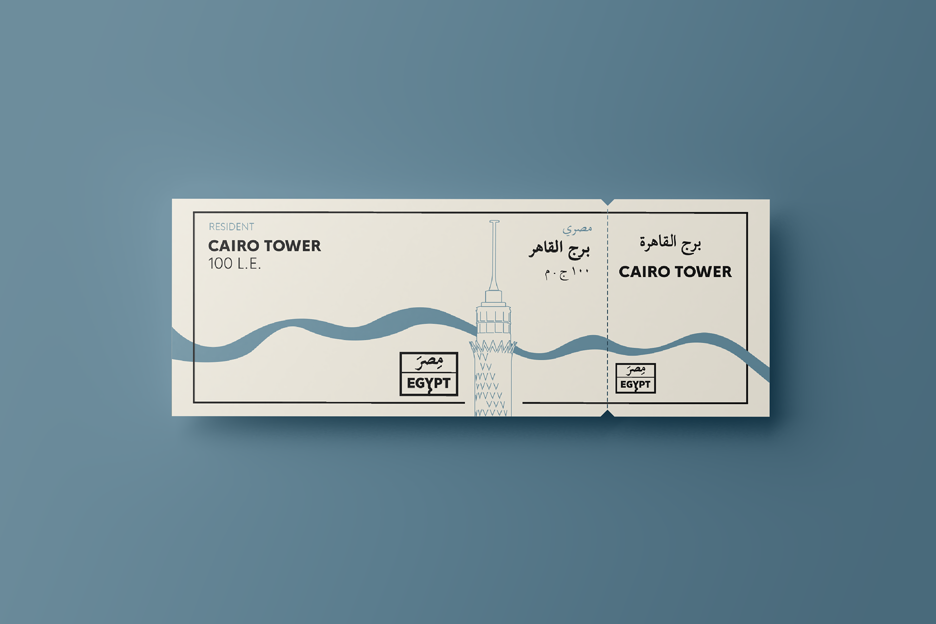
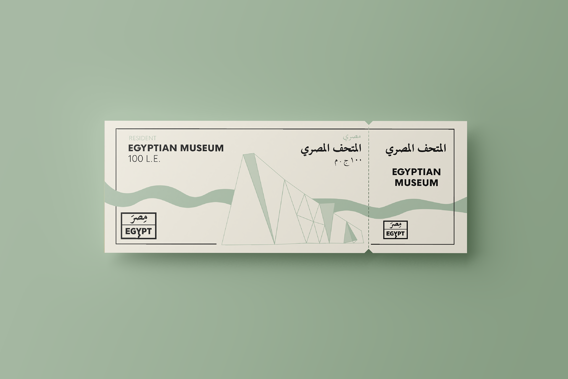
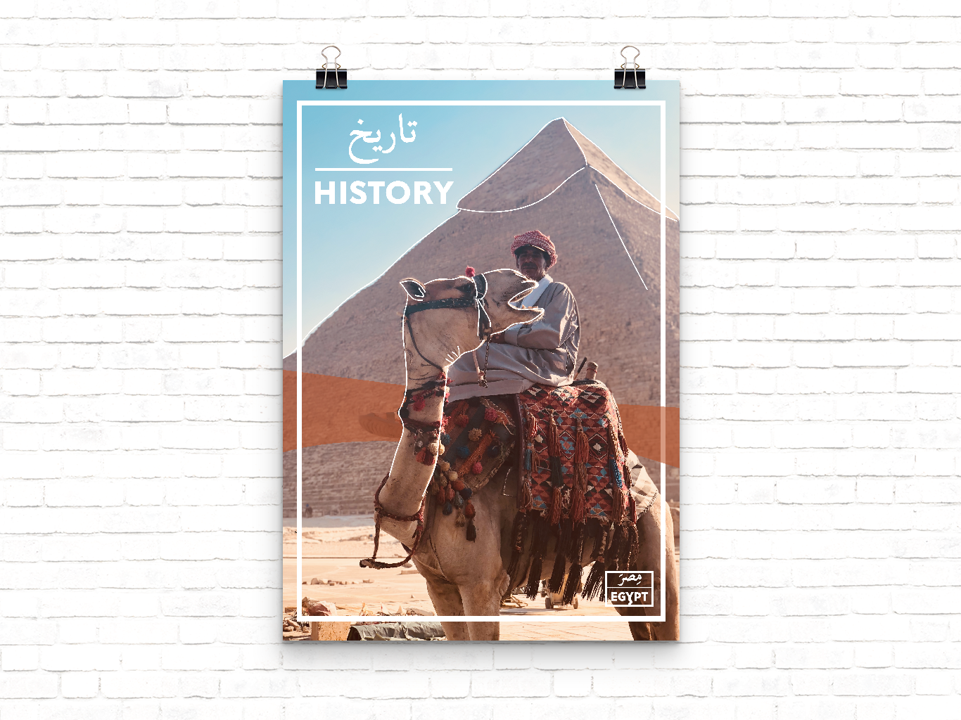
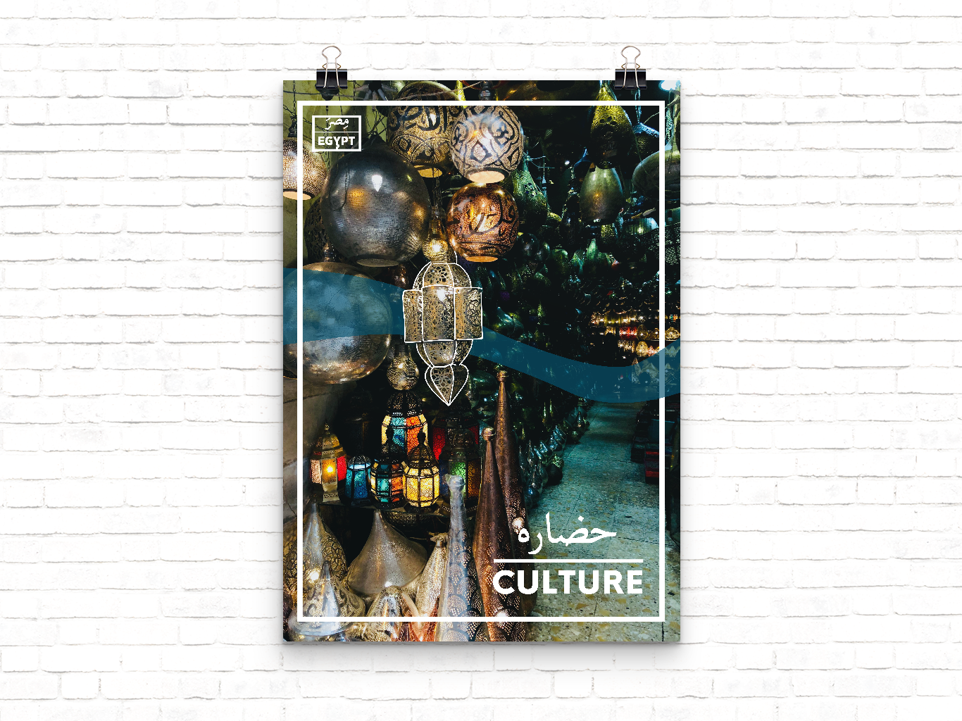
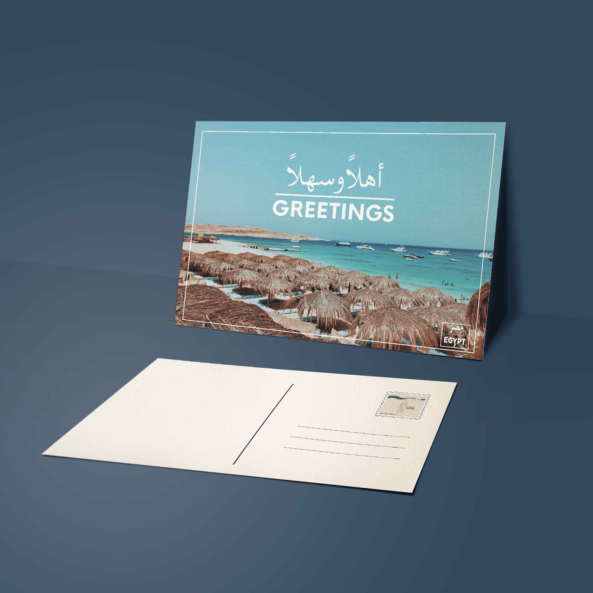
This project has been close and dear to my heart because of my connection with Egypt, and I wanted to make it in a way a personal yet universal. To start off, the logo was done to imitate the look of a street sign in Egypt, how it’s stacked, Arabic over English. Adding to that I added an extension to the ‘Y’ where it imitates the form of the Nile. As I worked on this project, I used those four colors as my main color palette, because of their meaning and how they symbolize four of the most important parts of Egypt. Along side the color palette, I used the wavy line in a lot of the pieces and it replicates the organic flow of the Nile, while adding an interesting design element to the project. The outlines, added to imagery, is meant to make the image more inviting, as well as add a modern touch of design to the historic Egypt that everyone knows about.
